Thursday, April 9, 2015

Montage: Activity 4

Activity 4
  • Find two examples of photomontages that are either from a commercial source or from a fine art background. Discuss in what context they have been produced and what techniques they share with political photomontages.
  • What messages, if any, are communicated through these photomontages and how effective do you think they are? Consider different ways that each image could have been tackled by the artist and come up with an idea for ‘another in the series’.

My Response
Dream Big - Connor Lesley
The image above is a photomontage created from 4 pictures. One of the ball court, one of the shoes, one of the little girl about to high five her friend, and one of Kobe Bryant about to dunk the ball. The image conveys the message to "Dream Big", and the use of images provides a huge assistance to that message, as it depicts a little girl attempting to block a dunk from professional basketball player Kobe Bryant; if that's not an example of dreaming big I don't know what is. However, the placement of the shoes in the foreground makes the image seem like an advertisement for Kobe's Nike brand shoes. Commercial photomontages such as this are fairly similar to political photomontages because they manipulate an image (or several images) to produce a different message than the original image provided, and of course, these messages are usually up for interpretation.

Just A Touch - Agence Alfred
The image comes from a fine art background, and is composed of 2 images. The first image of a hand holding a paintbrush and the second of the street and buildings. Personally, I don't see a very noticeable message in this picture other than "It's amazing what one stroke of a brush can lead to" or something like that. If I was to offer any advice on how to approach the image differently, I'd recommend erasing some of the background to make it seem like the hand still has more work to do. As for another image to accompany this one in a series, I'd picture this one as the end of the series while the one I recommended would come before it. 

Tuesday, April 7, 2015

Montage: Activity 3

Activity 3
  • As editors exercise their ever-increasing power over information control, what limits would you impose on them as to the extent to which they can manipulate the photographic image? 
  • Devise a series of guidelines that will control the release of images that have been constructed for media use so that the public is aware as to the extent of the manipulation.
    Doctored Image of President Hosni Mubarak at Mideast peace talks!
    Un-doctored Photo

    My Response
    As editors gain more and more control over what they can change within an image, it is important for us to be able to distinguish a difference between the real thing and the forgeries. Of course, setting regulations for these editors would be a great help in this situation. If I was in the position to tell these people what they can and can't alter I would say one thing, don't change anything that doesn't need to be changed. I say this because there are things that should not be on the cover of a magazine or the public news broadcast (such as an angry pedestrian flipping the bird or even nudity). Manipulating an image isn't entirely a bad thing, it can help clarify what certain objects are (by zooming in) or it just makes the image look more appealing (changing vibrance, contrast, etc.), these kind of edits are acceptable for publicly released media; cropping an image and moving the president of Egypt to make it look like he is leading other men into a peace talk isn't right, it's flat out lying. In conclusion, I don't think images should be changed or manipulated a lot from what they originally were, a few touch ups never hurt but moving/adding things to create a whole new meaning to the picture is wrong if used for the wrong purposes (entertainment vs. fooling the public). Below are some pictures I think are manipulated the right way and the wrong way..

    World Trade Center Hoax - WTCHoax.com
    This image is manipulated in the wrong way, instead of editing the color or brightness, an airplane was added into the background. A simple tourist image is turned into an almost surreal image all because an airplane was added, making the viewer feel like this image was taken at just the right time and that the man is now dead, which is not the case.
    World Trade Center - AVAXNews.com
    Not the most beautiful image I've ever seen but it follows the suggestions from above. The image was edited for color, and exposure. The explosions weren't added, the debris isn't fake, this picture is real and I feel like it has just as much of an impact as the fake one above and looks to be of better quality too.

Thursday, April 2, 2015

Montage: Activity 2

Activity 2: Blog Entry

  • Find two examples of political photomontages that are either from a historical or contemporary source. 
  • Discuss in what context they have been produced and how effective you think they communicate their intended message. 
  • Discuss the techniques that have been used to assemble the examples you have chosen and offer alternative ways that the artist could have put over the same message.
WandW-166.jpg

dance_dees.jpg

My Response

Protect And Survive - Peter Kennard
The picture above features a skeleton reading a magazine that says "Protect and Survive". The picture has an anti-war message, revealed mostly by replacing "Serve" with "Survive" from the phrase "Protect And Serve". It's not as impactful as depicting Hitler as a butcher, but it gets the artists' point across.

Explosive Minds - Peter Kennard
Another picture featuring a skeleton, yay! This one is interesting because it features a picture of a nuke going off but a skeleton is featured in the foreground. The photographer has managed to blend the skeleton's skull and neck with the "mushroom cloud" of the nuke, which makes for an interesting image and a subtle yet loud message: "One explosion in one man's head that has been translated into reality, can be the death of us all"

Friday, March 27, 2015

Montage: Activity 1

Activity 1: Blog Entry
  • Briefly discuss why you think painters of the Victorian period might have criticized these early photomontages and why the pictures were popular with the general public. (This technique of piecing together separate images to create one picture is again very popular with both artists and the media). 
  • What two reasons can you think of for this revival of an old technique?


    My Response

  • I think painters of the Victorian period criticized early montages because they didn't like the idea of taking an old picture, cutting certain things (such as people) from the picture, then setting these new cut-outs on a new background and taking a picture of it. With that being said, I believe the general public liked these pictures because they looked nice, and couldn't tell that one picture was really composed of multiple pictures. In a nutshell (and my own words), the Victorian painters were probably being kinda snobbish and saying things like "This is atrocious, it's not art, it's not original. This is just a bunch of cut out pictures on the same piece of paper." while a normal person would have just said "This looks cool, I like it."

  • The only two reasons I could think of as to why montages came back into style are: they were probably cheaper to make since you didn't have to pay for a set or models and that they were so different from what everyone else was taking pictures of. Basically montages allowed photographers to do with a camera what painters do with a brush, create a unique image with your imagination rather than by positioning people or waiting for something interesting to happen.

Tuesday, March 17, 2015

Portrait & Studio Photography: Activity 3

Activity 3
Collect four portrait images with two to five subjects. In at least one image the subject should have been placed in the foreground. Comment on the arrangement of the subjects in relation to the camera and the effectiveness of the design

Leading Man - Jeff Meyer
Based on the title of the image above, I'm going to assume that the man in the foreground is the lead singer or a band. The remainder of the band probably aren't too fond of the arrangement, since it may seem like the lead singer is more important (and you can barely see their faces), but I'm sure they'll get over it...

Bullet Club - NJPW
The image above is of The Bullet Club, a professional wrestling stable from New Japan Professional Wrestling (however, none of the men above are Japanese). Since my brother and I watched the event (via iPPV) that this picture was taken at, I can say that the placement of Nick Jackson, Prince Devitt, and Matt Jackson (the front 3 men) makes perfect sense because they actually wrestled at the show, the other 4 were just there to watch and lend support to their fellow Bullet Club members.

Painkiller - Three Days Grace
This is a picture released by Three Days Grace upon the announcement that Matt Walst would be joining the band as lead singer, Adam Gontier's official replacement. The announcement was met with a very mixed reaction by fans, so to me, the placement of the band members is almost symbolic; the three founding members of the band standing behind the new guy, almost as if to say "We're behind him, you guys should be too". Eventually this image would become the album cover for their song "Painkiller", the band's first song with Matt Walst on vocals.

Group Photo - Pinterest.com
Finally, a picture with girls in dresses! It's a fairly simple group portrait, all four women are on the same plane, they're all dressed up, but something just seems out of the ordinary. I know, three of  the girls are grouped on one side looking kinda judgy at the fourth girl. Maybe she smells weird, or they're just jel? (South Park reference below). Whatever it is, the looks on the three girls faces caught my eye and added something special to this group picture.


Friday, March 6, 2015

Portrait & Studio Photography: Activity 2

Activity 2 
Find four portraits that demonstrate the different ways a photographer has framed the image to alter the design and content. Discuss the vantage point, depth of field and subject placement in all of the images.

Unique Self Portrait - from Pixshark.com
The image above was either edited with photoshop or the poor man in the picture was holding a camera while hanging upside down in the forest, if the latter is the case this is quite possibly the coolest selfie ever taken. The depth of field is great and the subject is right in the middle, the most important part of this picture is the vantage point which makes the man appear to be falling.

Creative Self Portrait - from Pelfind.com
The image above was actually shot in a park on a foggy day (according to the website). The tree acts as a frame for the girl (which I believe is the subject of the image). The depth of field is hard to determine since the fog renders the background kind of hazy, but I'd guess the image uses great depth of field. The vantage point is pretty basic, just a slight distance away from the subject, but it gives the viewer a sense that the woman is trying to get out of the woods and that she's almost there.

A Looking In View - Joseph M Porter
This image has a very noticeable frame before the subject. The frame was most likely a column gate, which would make the viewer feel as if they were about to enter the property which the subject lies on.

John Morrison (Champion) - Deviantart.com
The image above shows John Morrison (no relation to Jim Morrison, despite the uncanny resemblance) posing with a championship belt. The vantage point of the image (below eye level of Morrison) and the subject placement (center of the ring) help to produce an image of a proud champion ready, willing, and able to overcome any obstacles that may approach him.

Wednesday, March 4, 2015

Portrait & Studio Photography: Activity 1

Activity 1
Look through assorted media, magazines, internet and collect four portrait photographs. The environment should be a key feature in two of the four images. Describe the subject’s character in each of the images. What can you see within each image that leads you to these conclusions about the subjects’ character.

Empire Magazine, April 2013 Edition - Empireonline.com
This magazine cover features Robert Downey Jr. on the cover in his Iron Man armor. The background features a dark sky and the foreground has sparks, to signify that there is trouble. Obviously the cover promotes Iron Man 3, so it's supposed to show that he is heroic (RDJ's pose), he is in for one heck of a fight (the sparks and slight scratches on the armor), and the situation may seem hopeless but he will keep going (the dark sky with a little bit of sun on a cloud).

Jared Leto, Oscars 2014 - Hollywoodreporter.com
This is a photo of Jared Leto during his acceptance speech for Best Supporting Actor at the 2014 Oscars. Leto is the focus of the picture, as shown by the shallow depth of field, which is a good idea since he's up on the stage to accept an award.

Untitled - Patrizia Burra
This is a photo by Patricia Burra, and it utilizes studio lighting to put emphasis on certain parts of a girls face. There are shadows around the girls eyes and under her lips which adds some depth to the picture so the viewer can see that the girl is making a pouty face.

Adam Gontier - Larry Marano
This is a photo of former Three Days Grace Singer, Adam Gontier. The photo depicts Gontier backstage  before performing at The Sound Advice Amphitheater in Florida. Gontier's relaxed pose in the picture shows that he isn't worried about going out to perform because he's used to it.

Friday, February 13, 2015

Self Image: Activity 3

Activity 3: Blog Entry
Consider some of the social pressures that you think may shape your behavior and personal image.
  • List the images most commonly associated with the categories or ‘boxes’ you have already listed in Activity 1. 
  • How have you responded to social pressures to conform by adopting an appearance that relates to the categories that you feel you have placed in or have chosen?

My Response
Conformity is like a virus, it keeps spreading and only some people are immune to it. I've always been strongly against the concept of conformity, because I don't wanna be like other people, I want to be me. So many people choose to conform because it makes them fit in with the cool kids, and they just want to be accepted. I'm unaware of the ways I have responded to social pressures, but I'd like to think that I've just been me since day one. I was wearing superhero stuff before it was cool because when I was younger I always read comic books instead of watched TV. To this day I still watch nothing but cartoons, I barely found out who Kim Kardashian is about 3 years ago. I wear leather jackets because I've always thought they were cool, and don't really care that we live in Arizona where it's always hot. I've dressed the same way since kindergarten, just a simple combo of t-shirt and jeans, maybe the occasional dress shirt but nothing too fancy. I guess my response to conformity is just to ignore it and do my own thing, because I'd rather walk alone than be another wolf in the pack.

If everyone gave into the pressures of society and chose to be like everyone else, this is probably what a like outside of a grocery store would look like, except maybe with more modern clothes. Point is, we would all dress, walk, and talk the same way, like a bunch of factory drones.
People always say that I'm a really big anti-conformist, which is kind of true. Personally I just prefer to stick out from the crowd, I don't want people to dress like me and listen to my music because then I would be the source of something I don't like, which is unoriginality. Sweet dreams are made of this and everybody's looking for something, but I just want something else.

Tuesday, February 10, 2015

Self Image: Activity 2

Activity 2: Blog Entry
Find images in the media, which have been used to represent attractive and unattractive aspects of the human face. Examine and record carefully the photographic techniques used to accentuate both these qualities, drawing up a list that relates to the images you have found.
  • List the physical characteristics that we have come to admire in both the male and female face and write 100 words in response to the following questions: 
  1. Do you believe that media images or public opinion are responsible for the characteristics of beauty becoming universal stereotypes? 
  2. Do you believe people admiring media images of glamorous models can do any harm?
My Response
  • Media images and the public opinions that come with them have changed what people view as beautiful. Below are two images: 

The image on top is of New York City on a typical day in the winter. The Image on top is the stereotypical picture of New York City and all it's beauty at night. The bottom one gets everyone's attention and makes a lot of people believe that the city looks like that once you're in, but it really doesn't (as shown in the top image). I chose to use a picture of a city instead of people because all the people used in media are pretty, it's their job. The typical person used for magazines, commercials, and any other media usually has defined facial features, a perfect body, and a million dollar smile, but not everybody looks like that. The same can be said for these pictures of New York, one looks pretty and gets people to go check it out but the city really looks like the other image.
  • My answer to the question of whether people admiring media images of glamorous models can do any harm, is a very simple "Yes", but it won't stay simple for very long. Beauty is open for interpretation, Matte vs Shiny, Beach Ball vs Hourglass, Young vs Old, everybody has their own preference, but when the same thing is constantly covered and displayed by the media it becomes the standard. People will begin to believe that these models are everyday people that can be found at the McDonald's which isn't the case. The level of harm varies of course, will a girl get turned down because she doesn't look like Kim Kardashian? I hope not, but maybe. Will a guy say yes but wish he had Scarlett Johansson instead? Kinda very likely, depends on the age of the guy I guess. The same can probably be said about women, but I have no idea how they think so I won't speak for them. So in a nutshell, idolizing models isn't a completely bad thing, but don't let it affect your expectations or else it will do more harm.

Friday, February 6, 2015

Self Image: Activity 1

Activity 1: Blog Entry
What follows is a list of categories that serves to define and divide us. Make a personal list of the categories you belong to or have conflict with and visual symbols that are associated with each. Aspirations and expectations should also be listed.
  1. Age/generation - is can dictate levels of independence afforded to the individual. 
  2. Gender - Our sex affects the way we are treated by some individuals. 
  3. Race - Prejudice and perceived racial superiority can affect hopes and aspirations. 
  4. Religion - Moral codes and ideologies that serve to guide, unite and divide. 
  5. Class or caste - A classification that an individual may never escape from. 
  6. Personality - Extrovert and introvert are classifications of personality. 
  7. Intelligence - educational establishments, based on IQ, often segregate us. 
  8. Political persuasion - Left wing or right wing. Each carries its own ideology.
My Response
  1. Age/Generation - Right now, I'm 18 so I basically have the freedom to do as I please, but I choose not to because it's fun to act like a kid still. I feel like this isn't the social norm for my generation, everyone's growing up quick and getting out in the world by the time they leave high school, yet here I am playing with action figures and reading comics in my room during my free time.
  2. Gender - I'm a male, I've never really noticed anything different about the way people treat me. The only really annoying thing I've noticed about being a guy is that I have to pay for everything myself and get a job (which I refuse to do).
  3. Race - I'm of Spanish decent, but for the most part I'm just an american boy. My family never practiced any specific traditions, I don't even speak spanish (which is usually expected by some of my relatives or peers). If I had a dollar for every time somebody said to me "Oh you don't speak spanish?" I would be a millionaire.
  4. Religion - I'm not a religious person, but I like to think there's something up there after we die. I try to just be a good person and avoid doing things I'll regret. If I had to pick one religion that I fall under, I guess it would be Mormonism, but to claim that one would be quite a stretch.
  5. Class/Caste - Me and my parents are considered to be in the upper middle class. My parents own a big house, full of nice furniture, and two (almost) brand new cars. I don't really own anything, so for now I'm just piggy backing off of them.
  6. Personality - I'm a fairly introvert person. I prefer to be alone, or with a small group of close friends. The only time I enjoy being around large groups of people is during a wrestling tournament/duel.
  7. Intelligence - I'm pretty smart. I'd say I'm pretty well rounded in everything but I usually get a lot of attention for my writing, especially my creative writing and essays, but I am terrible at math. This fact actually introduced me to one of my best friends, Ky, because she hated (and kinda sucked at) english but she was really good at math.
  8. Political Persuasion - Politics aren't my cup of tea, since I have very little control over what politicians do. Plus there's so many people today that very loudly and publicly voice their political views and opinions, but sometimes they have no idea what they're talking about and just make themselves look dumb, so I'd like to avoid being one of those people. Personally, I look at politicians as puppets; One is red, the other is blue, just pick the one that will work for you.

Monday, February 2, 2015

Time: Activity 5

Activity 5
Blog Entry
Create four images that contain a mixture of solid (sharp) and fluid (blur) forms. Using the camera that you have been checked out, create four images as creatively and artistically as you can!


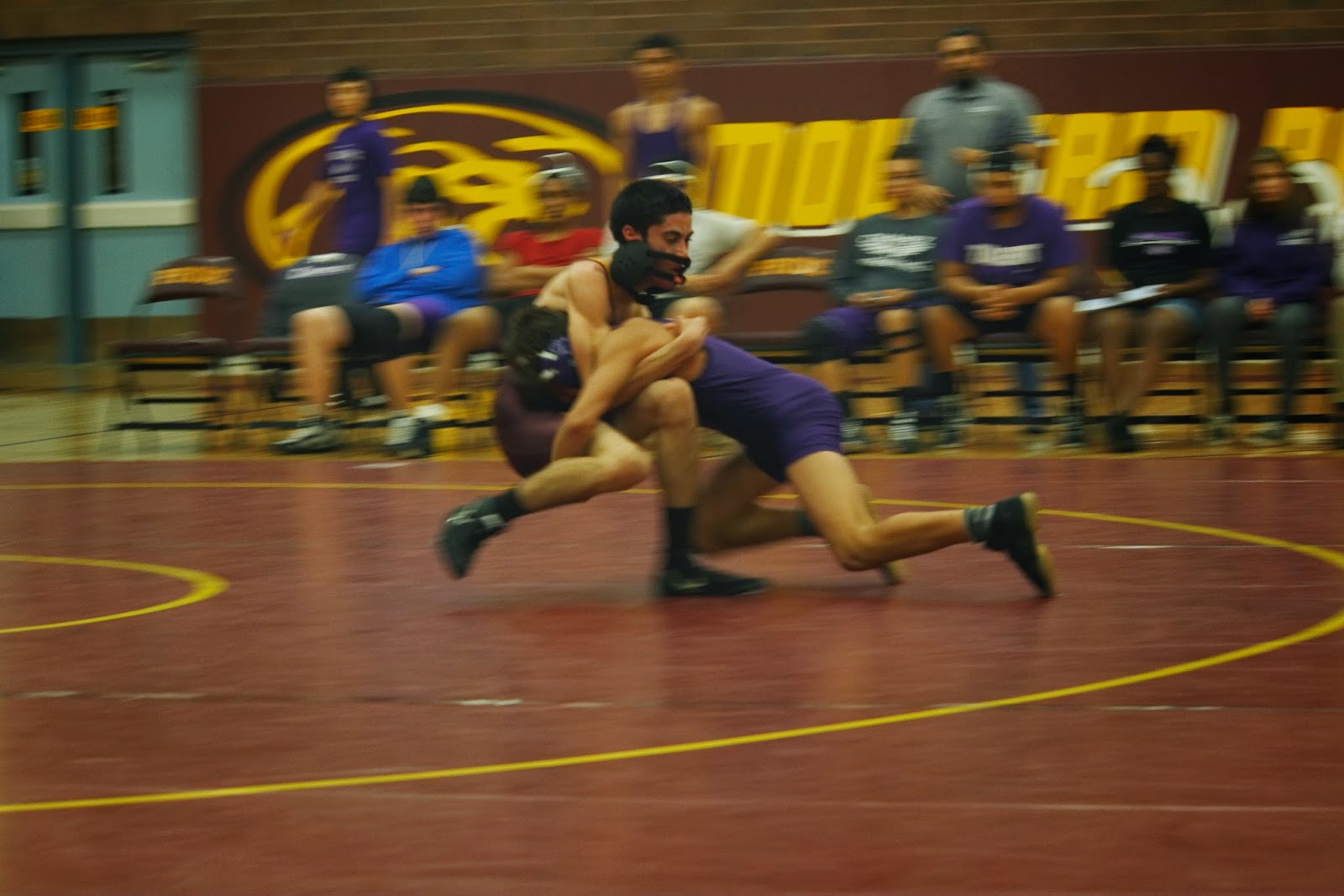
The following pictures were taken at a wrestling duel, Mountain Pointe vs Caesar Chavez. To capture them, I followed the wrestlers whenever a takedown was attempted, which kept them kind of solid while the background became more fluid. Hopefully the pictures turned out okay, I know I liked them.

Travis Myers taking down his opponent. Sadly, the takedown didn't count because his opponents feet landed out of bounds. Poor kid had to go into overtime because of that.
Justin Hagart moments before pinning his opponent. There isn't a whole lot of blurred motion in this image other than the Caesar Chavez kid's leg and hand.
Romeo Chavez about to suplex his opponent. He set this move up really nice; at the start of the second round his opponent chose bottom, so Romeo just let him stand up without any resistance and then hit this move. Romeo used this move 6 times in this match.
Romeo Chavez moments before reversing his opponents takedown. Romeo used his opponents momentum against him to kick him over and then get the pin.

Sunday, January 25, 2015

Time: Activity 4

Activity 4
Blog Entry
Find a photograph where the photographer has used a slow shutter speed and describe the subject matter including the background.Discuss any technical difficulties the photographer may have encountered and how these might have been overcome.
  • Discuss what happened to the depth of field and why.
  • Discuss whether the image gives you the feeling of movement, stating the reasons for your conclusions.
Still Life - Siti Sorfiena Syasha
The picture above depicts a soccer game that was shot using a slow shutter speed. Only one player is clear while everyone else appears as blurred figures. One of the technical difficulties the photographer might have encountered was capturing the one player that isn't blurred. I'm going to guess that this obstacle wasn't to large and was overcome by asking the player to hold still and pose while he was not playing. The depth of field is not affected too much by the camera settings, but if looked at carefully, it gets slightly shallower as you begin to look further behind the player. The image gives me a feeling that there is movement in the picture, because of the players that appear blurry (because they are playing) and the one kid that appears clear (because he is standing still).


Tuesday, January 20, 2015

Time: Activity 3

Activity 3

Blog Entry

Take four images of a running or jumping figure using fast shutter speeds (faster than 1/250 second). Vary the direction of travel in relation to the camera and attempt to fill the frame with the figure. Examine the image for any movement blur and discuss the focusing technique used.

Take four images of the same moving subject using shutter speeds between 1/15 and 1/125 second. Pan the camera to follow the movement. The primary subject should again fill the frame. Discuss the visual effect of each image.

Wednesday, January 14, 2015

Time: Activity 2


Activity 2

Blog EntryFind an example of a photograph where the photographer has used a very fast shutter speed and describe the subject matter including the background. Discuss any technical difficulties the photographer may have encountered and how he or she may have overcome them.

  • Discuss what happened to the depth of field and why.
  • Discuss whether the image gives you the feeling of movement, stating the reasons for your conclusion.
Paint Bucket - from MegaPhotography.com
The photo above shows drops of paint splashing back up after falling back into the container. Since the drops were in motion while this picture was taken, the photographer needed to adjust his camera to overcome this very minor inconvenience. One of the more obvious adjustments made to the camera involved the F-Stop settings, since the depth of field is fairly shallow that means that the F-Stop setting was lowered. In the end, the photographer was able to accomplish beautiful stop motion at the slight cost of having a shallow depth of field. Job well done photographer.

Time: Activity 1

Activity 1


Blog Entry

Look at a Henri Cartier-Bresson photograph and discuss why you think that capturing the decisive moment has added to the picture’s quality.
Final Days of the Kuomintang- Henri Cartier-Bresson
According to the information that accompanied this image on magnumphotos.com, this is an image of a Chinese merchant, eating the last of his provisions. Due to the decisive moment in this picture, it looks like the man is sitting down and eating a meal he has just purchased from the store behind him, with the owner of said store looking at him. This is a much more pleasant take than reality, where the man's store has shut down and he is now eating the last of his provisions to reduce the weight he must carry with him everywhere around Beijing while searching for a new place to set up shop.